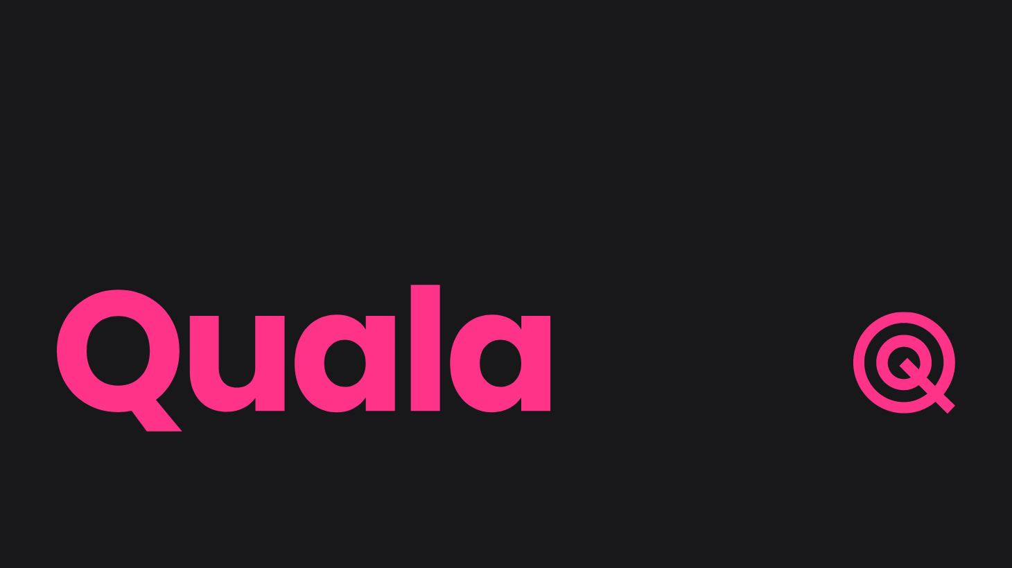
Major Tech Company is Ditching Cool Blue and is Going Magenta Instead
Quala’s mission is to solve the mounting frustration of frontline teams in SaaS businesses trying to prioritize what they know customers need. And, ease the mounting frustration of cross-functional teams trying to hear them.
According to 99designs.com, 61% of tech companies opt for a cool blue when it comes to their logo and less than 2% decide on pink for branding tactics. Quala, is one of the few who has stepped out of the tech comfort zone and has gone magenta.
“Our new color palette is big and bold: magenta, pink, orange, yellow, fuchsia, and purple. It’s warm, bright, and lively. It’s how we want our customers to feel when they work with Quala” – Mike Redd, CMO of Quala
Back in the fall, Quala launched new capabilities to allow their customers to mine their qualitative data streams for insight. They are working hand-in-hand with their customers to use these insights to inform their internal product priorities, identify at-risk customers, and find revenue expansion opportunities. Helping customers in this new way is a special milestone in Quala’s journey as a business.
“We wanted our brand to reflect the bold insights and the clear visibility that we are delivering for our customers. We wanted Quala’s color palette to be exciting and evocative – to draw out the deeply human emotions that only qualitative data can evoke.” – Mr. Redd
For most individuals, data can be intimidating and unapproachable. Applying that data to take the right actions in your own business can be even harder. However, Quala is working to make this a lot easier for frontline teams like Customer Success and the teams that listen for frontline feedback like Product.
Quala’s Goal
Quala wants to make it much easier for everyone in the business to understand what customers say, teams hear, and customers do in their products. They call this capability “frontline intelligence”. Their customers use it for everything from creating data-backed product roadmaps to identifying individual at-risk customers.
“Design is really important for how humans interact with technology. We wanted to make sure the Quala brand reflects who we are as a team and as a business.” – Mr. Redd
There is a lot more to Quala than just the colors. Check out everything that’s been updated in the brand look-and-feel at www.quala.io and to learn more about Quala’s frontline intelligence.”
For media inquiries, please contact [email protected]
Media Contact
Company Name: Otter PR
Contact Person: Natalie Graham
Email: Send Email
Phone: 2076712693
Address:100 S Pine St 110
City: Orlando
State: Florida
Country: United States
Website: www.OtterPR.com


